Policy Spice
A User-Centric Compliance Solution.
Policy Spice makes compliance management a joy with its user-friendly design and smooth workflows. As the UI/UX designer, I delved into the UX case study, spearheaded the app's interface design, and created a captivating website aimed at enticing both clients and investors.
Role: UX Designer / UI Designer
Date: August - October ‘22
Tools: Figma, Illustrator, Photoshop
Team
James Paten (UX Researcher)
Kareem Asfahani (UI/UX Designer)
Ihab Matouk (Developer)
Mira Shaaban (Copywriter)
Jump to

The Problem.
Website owners struggle to efficiently manage compliance due to limited customization options and cumbersome setup processes.
The Solution.
Create an app that offers extensive personalization options while simplifying and speeding up compliance setup.
Introduction
.
I joined the Policy Spice project as the UI/UX designer after our UX researcher had completed the initial user research. My role started by helping him analyze the raw data and synthesize valuable insights.
As an agency, we faced the challenge of ensuring our clients' websites complied with privacy laws to avoid fines. However, after testing various products currently available, we found that very few of them followed the rules, and even fewer worked properly. Our clients echoed our dissatisfaction, prompting us to create Policy Spice—a solution prioritizing both compliance and user-friendliness.
Research Insights
Users really care about personalization, aesthetics, ease of use, and a quick set up.
We gathered a wealth of data from surveys and interviews, delving into the challenges faced by website owners in navigating privacy regulations.
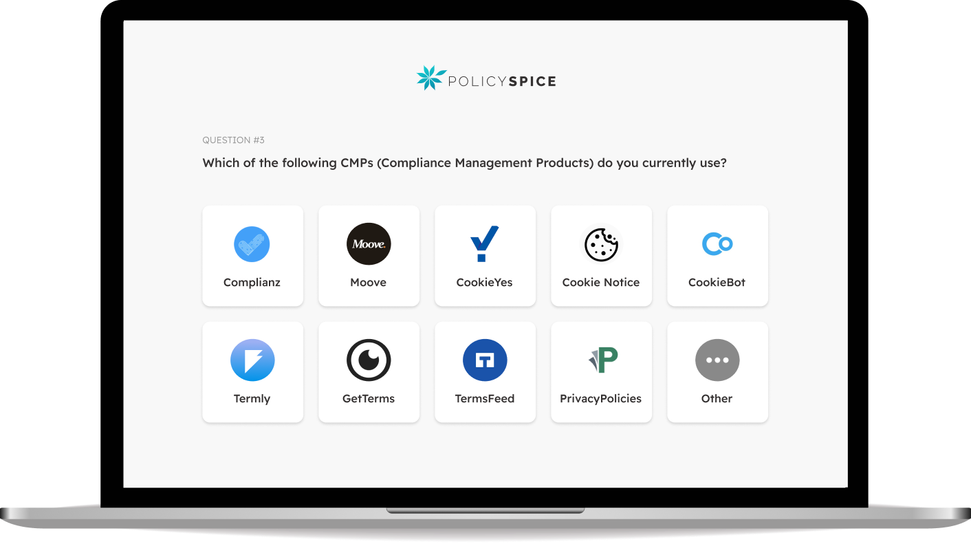
From our survey analysis, it was clear that the market for compliance management tools was dominated by names like CookieBot, CookieYes, and Complianz. However, users expressed a desire for improvements in key areas: Personalization, User Friendliness, and Quick Set-Up.
Insights from user interviews provided deeper context, emphasizing the importance of Aesthetics, Smooth Experience, Speed, and Clarity in Communication.
With these insights in hand, our team embarked on a design journey aimed at addressing these pain points, ensuring compliance while prioritizing user satisfaction and ease of use.
Competitive Analysis
We identified design opportunities like advanced personalization, a simplified user interface, and comprehensive user guidance.
Following our deep dive into user insights, the next logical step was to conduct a thorough analysis of the competitive landscape within the compliance management products (CMP) sphere. By scrutinizing major competitors, we aimed to identify strengths, weaknesses, and strategic opportunities shaping our product and marketing strategies.
01 Competitive Positioning
Policy Spice can stand out by addressing gaps in competitor offerings, especially in personalization, user guidance, and dashboard clarity.
Key Findings
02 Common Pain Points
Users faced similar issues across CMP solutions, including confusion in customization, unclear policy generation, and cookie management challenges.
01 Robust Personalization
Develop advanced customization features to cater to diverse user needs, fostering engagement and allowing website owners to stick to their branding.
Design Opportunities
02 Simplified User Interface
Streamline the interface for easier navigation, reducing complexity and cognitive load especial when it comes to generating long and complex policies.
03 Comprehensive User Guidance
Provide clear and intuitive guidance throughout the platform to assist users at every compliance stage, reducing confusion.

Problem Statements
After conducting an in-depth analysis of user insights and market research, we turned our attention to defining our problem statements or in other words the core problems that website owners encounter when setting up compliance.
01
Website owners who have heavily invested in their brand’s aesthetic need to have more control and customization options for their consent banners and policy pages because they aim to provide their visitors with a consistent brand experience and message.
Lack of Personalization Options
02
Complexity in Compliance Management
Website owners, especially those running online businesses, need to manage their compliance obligations with ease and minimal effort because setting up compliance can be a taxing process.
03
Website owners need to quickly set up compliance because they don't have the time needed for them to establish it completely from scratch and in depth.
Time Constraints
User Personas
Next, we created three user personas, each representing one of our problem statements. These fictional characters are meant to embody the behaviors, motivations, goals, and pain points of our target audience, allowing us to pinpoint precise user needs, tailor design solutions accordingly, and ultimately create a more user-centered product.
Journey Maps helped us uncover design opportunities such as ready-to-use templates and live previews.
User Journey Maps
After creating user personas, the next step was to design user journey maps for each of them. We will be able to identify opportunities to improve their experiences, by gaining a deeper understanding of each persona's needs, emotions, and motivations as they interact with their current CMPs.
For example, by mapping out Jackie's journey, we gained insights that helped us identify design opportunities that will satisfy her specific needs and goals.
01
Introduce a live preview feature for real-time visualization of design changes.
Design Opportunities for Jackie
02
Enable users to quickly preview their designs on different devices and in various countries.
03
Offer templates with ready-to-use visuals and content that can be used as-is or as a launching pad.
How Might We Questions
As we moved forward, our focus shifted to ideation. To make sure our solutions meet user needs, we started the ideation phase by asking ourselves "how might we" questions.
These questions served as catalysts for idea generation and they later played a pivotal role in shaping our information architecture and user flows.
Question 01
How might we offer website owners additional customization options so they get results that align with their brand's aesthetic while still complying with legal requirements?
Question 02
In what ways might we simplify the process of setting up compliance for online businesses, so website owners can focus on running their business instead of navigating compliance obligations?
Question 03
How might we help website owners quickly establish compliance without sacrificing thoroughness, so they can avoid penalties and potential legal issues?
We customized user flows to match our user personas, guaranteeing easy navigation for our end users. For instance, with Adam, we mapped out several flows he needs to take to create a cookie consent pop-up from scratch using our "Get Started" guide.
We fine-tuned each step to meet user needs throughout this process, prioritizing simplicity and intuitive design. By putting users at the center of our approach, we ensured a seamless experience for everyone, showcasing our dedication to accessibility and user-friendly design.
User Flows
-
![]()
Style it.
-
![]()
Color it.
-
![]()
Lay it out.


Wireframes
Once we completed the user flows, we were excited to dive into the next phase of our UX project - wireframing. With the wireframes, we carefully highlighted our product's key elements and functionality. This visual exploration allowed us to get creative and try out various design concepts, giving us room to iterate and refine our ideas before delving into high-fidelity prototypes. It was an exciting step that brought us closer to bringing our vision to life!

.
HIGH FIDELITY PROTOTYPE ✴
WEB APP ✴
HIGH FIDELITY PROTOTYPE ✴ WEB APP ✴

Getting Started Guide
Our first job was to put together a prototype for the "Getting Started" guide to set up a cookie popup. This guide is crucial because it helps users understand our product's main features, which we think most will use when they first sign up. It consists of five steps and we've designed it to seamlessly guide new users step by step.

Step 1
The Cookie Scan
First and foremost, our “Getting Started” guide strongly advises conducting a thorough cookie scan to precisely identify which cookies are currently active on the user's website.
An adaptable side menu.
The side menu adjusts for different layouts, letting us expand main cards while keeping the menu and icons visible whether the menu is expanded or collapsed.
Not wasting users’ time.
We understand that users can become impatient, so we decided to provide them with the option to proceed with the guide while the Cookie Scan runs in the background.
Step 2
The Pop-up’s Message
In the second step of the guide, users create content for the cookie consent pop-up by selecting regional policies, providing existing policies, receiving compliant copy for editing, and choosing which buttons to include.
-
It goes without saying that, according to our research, live previews are very important to most users. Not only do they need to be able to see the end results in real time, but also on different devices.
That's why we dedicated a big chunk of screen real estate to this feature alone. They are also able to preview how it will appear in different countries, since the pop-up content varies based on location and regional data regulations and policies.
-
We didn’t want users to feel overwhelmed by too many questions at once. So, each question is presented on a separate card, reducing cognitive load and allowing thoughtful and accurate responses, resulting in greater ease and confidence for the user.
-
To make sure that the final cookie consent pop-up is responsive across all devices and functions properly within our pre-designed templates, we decided to limit the number of characters within the input fields to an amount that is enough for almost all cookie consent copy.
Step 3
Styling The Pop-up
The third step of the guide is where things start to get fun for our users. This is where they can really make it their own and give their banner some personality. We offer them with many options to personalize the pop-up's size, fonts, button shapes, and more.
-
Replacing specific font sizes like “12pt” and “24pt” with choices like "tiny" and "huge", makes it easier for the user to choose, while also ensuring that the pop-up will function properly within our pre-designed layouts.
-
Providing users with the option to duplicate the styling options they've already created for the first button can be a great time-saving feature. This way, they no longer have to worry about remembering and selecting the same styling options all over again.
This feature can also help users effortlessly maintain consistency across all buttons in their project by reducing the amount of repetitive manual work.
-
Instead of using drop-downs or radio buttons, we decided to use large buttons with visual representations to make things clearer. We also added a brief description for each option to provide even further explanation.
Step 4
Coloring the Pop-up
The fun continues here for our users because now it's time to color their pop-ups. With our color picker, users can let their creativity run wild, customizing the banner, fonts, buttons, borders, and even hover states for links.
Each element has its own color picker, grouped together for easy access, ensuring users can maintain their branding colors effortlessly with options like HEX, RGB, and HSL formats. The color picker, of course, includes other features such as a preview window, hue slider, and an opacity selector.
Step 5
The Pop-up’s Layout
The fifth and final part of the "Getting Started" guide is for users to choose the layout of their pop-ups. Here, users can see how their newly created pop-up is responsive across devices, and choose how it appears to website visitors on different screen sizes.

Real-Time Editing with Live Mockups
Our users can experience the full power of our Live Preview feature by viewing how various pop-up layouts appear on different devices in real-time. This allows for a more comprehensive and customizable experience for users who want to ensure that their pop-up layouts are optimized for all screens sizes.
Other Prototypes

Policy Generator
Providing Personal Details
We presented each question on its own screen to gather user and website information. This resulted in large input fields and dropdowns, avoiding overwhelming users with an overload of questions.

Policy Generator
Drafting the Policy Content
Writing policies can be daunting, especially for beginners. Our solution? We break down the policy into separate, easy-to-handle sections, each on its own screen to keep things easy.

Cookie Management
The Cookie Jar
We know that the list of cookies on a website can get pretty long, so we designed a high-powered and flexible filtering system that allows users to accurately and efficiently filter through different cookies.


